- 1INTRODUCTION
- 2SETTING UP A NEW SYSTEM
- 2.1The Organisation Structure
- 2.1.1Creating, Editing and Deleting Organisation Chart Items/Adding Posts
- 2.2Users
- 2.2.1Creating, Editing and Deleting Users
- 2.2.2Supporting Data
- 2.2.2.1Access Levels and User Groups
- 2.2.2.2Reporting Group
- 2.3The Strategy Map
- 2.3.1Overview - Flat and Complex Models
- 2.3.2Creating, Editing And Deleting Strategy Map Items
- 2.3.3Strategy Item Types
- 2.3.4StrategyMap Performance Target items
- 2.3.5Strategic Contributions
- 2.3.5.1Normalising Strategic Contributions
- 2.3.5.2Flat Strategy Map
- 2.3.6 Strategy Map Tags
- 2.3.6.1Overview
- 2.3.6.2Setting up data tags
- 2.3.6.3Attaching data tags to performance targets
- 2.3.6.4Reporting data tags
- 2.4Performance Indicators
- 2.4.1Overview
- 2.4.2Performance Indicator List
- 2.4.3Creating, editing and deleting Performance Indicators
- 2.4.4Perspectives and Indicator Types
- 2.4.5Performance Indicators Set Up Considerations
- 2.4.6Supporting data
- 2.4.6.1Performance Indicator Categories
- 2.4.6.2Performance Indicator Types
- 2.4.6.3Scorecard Perspectives
- 2.4.6.3.1How to use Perspectives
- 2.4.6.4Scorecard Perspective Categories
- 2.4.6.4.1How to use Perspective Categories
- 2.4.6.4Units of Measure
- 2.4.6.5Time Intervals
- 2.5Equation Builder
- 2.5.1Creating, Editing, Deleting Equations
- 2.5.1.1Measurements
- 2.5.1.2Parameters
- 2.5.1.3Equations
- 2.5.1.4Example Equation
- 2.5.1.5Attaching Equations to Performance Indicators
- 2.5.1.6Using Performance Indicators in an Equation
- 2.5.1.7Equation measurement workflow
- 2.5.1Creating, Editing, Deleting Equations
- 3PERFORMANCE TARGETS
- 3.1Overview
- 3.2Rules Governing Performance Targets
- 3.3Target Setup: Add/View Targets
- 3.4Target Setup: Target Creation Wizard
- 3.5Entering Target Measurements, Validation and Reporting
- 3.6Editing target fields and related objects
- 3.6.1Edit target fields
- 3.6.2Edit target measurements
- 3.6.3Edit target comments
- 3.6.4Edit target delegation
- 3.7Add/View Responsibility
- 3.8Editing target value for more than one measurer
- 3.9Ending targets
- 3.10TargetExport and Import
- 3.11Exporting Target Data
- 3.12Importing Performance Data (from Measurement Entry window)
- 4ACTION PLANNING
- 5ASSESSMENTS
- 6THE CONTROL PANEL
- 6.1Header Buttons
- 6.2Control Panel tabs: Overview
- 6.3Control Panel display
- 6.4Control Panel tabs
- 6.4.1Dashboard Tab
- 6.4.2Task Tab
- 6.4.2.1Measurement Tasks
- 6.4.2.2Validation Tasks
- 6.4.2.3Action Plan Tasks
- 6.4.3.4Assessment Tasks
- 6.4.3.5Measurement Planner
- 6.4.3Performance Targets Tab
- 6.4.4Reports Tab
- 6.4.5Staff and All Users Tab
- 6.4.6Action Plan Tab
- 7REPORTS
- 8SYSTEM MAINTENANCE
- 9HELP AND SUPPORT
- 2.1The Organisation Structure
Control Panel: Performance Targets
This tab shows user's performance progress from the measurements of the performance indicators associated with their assigned performance targets:
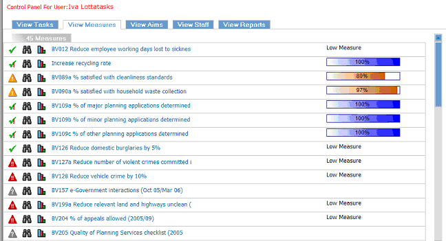
Note: Progress bars only appear for performance targets which have a numeric value where high is good. They don't represent progress towards dates or relative to low values.
Key
-

- Performance measurements on target

- No measurements

- Performance measurements over achieving

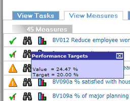
- Click to view current measurement and performance target value

- Performance at risk of failing

- Click to display performance target graph

- Performance failing
On the right, the progress bars give an instant visual overview of how close to completion the performance target is. The colour of the bar shows the performance target's status relative to its target at this time (red means "failing", amber means "behind target", green means "on target", and blue is exceeding target - see Control Panel Display). The percentage and the length of the bar shows absolute progress towards a target. For example, the target bar could be at 20% and blue indicating that performance indicator measurements are exceeding expectations but the target is still not complete.
The icons on the far left show a summary of the user's peformance progress, clicking on the binocular icon allows the user to see the current performance indicator's value and the target value:
Clicking on the graph icon link goes directly to the performance target graph:
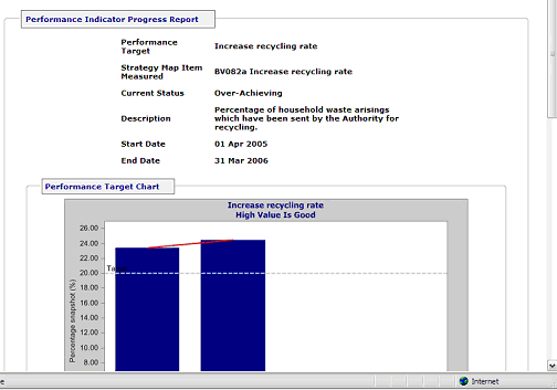
Graphs show a range of information about a performance target. By default, the graph shows progress on the performance target, the performance target value (red line), and where the current measurement progress is currently relative to its target.
Target values for performance targets where values fall into a range will appear as two lines, for the top and bottom of the range.
For measurements of cumulative PIs, each point is the data entered plus all the previous entries (graphs will tend to rise). For measurements of average PIs, each point is the average of all previous entries (graphs will tend to flatten out). For measurements of snapshot PIs, each point is the data entered (graphs may go all over the place).
The Chart Values tab allows additional data shown on the graph. Changing the Y (vertical) axis value allows "zoom in" or out on a graph, e.g. for a graph where all the points are in the range 200-210, changing the minimum Y value to 190 would give a more close-up view of the line.
The Chart Image, Chart 3D and Chart Border tabs enable customising of the graph's appearence. Chart Image allows a choice of scatter charts, curves, area, bar or line graphs.
![]()
![]()