- 1INTRODUCTION
- 2SETTING UP A NEW SYSTEM
- 2.1The Organisation Structure
- 2.1.1Creating, Editing and Deleting Organisation Chart Items/Adding Posts
- 2.2Users
- 2.2.1Creating, Editing and Deleting Users
- 2.2.2Supporting Data
- 2.2.2.1Access Levels and User Groups
- 2.2.2.2Reporting Group
- 2.3The Strategy Map
- 2.3.1Overview - Flat and Complex Models
- 2.3.2Creating, Editing And Deleting Strategy Map Items
- 2.3.3Strategy Item Types
- 2.3.4StrategyMap Performance Target items
- 2.3.5Strategic Contributions
- 2.3.5.1Normalising Strategic Contributions
- 2.3.5.2Flat Strategy Map
- 2.3.6 Strategy Map Tags
- 2.3.6.1Overview
- 2.3.6.2Setting up data tags
- 2.3.6.3Attaching data tags to performance targets
- 2.3.6.4Reporting data tags
- 2.4Performance Indicators
- 2.4.1Overview
- 2.4.2Performance Indicator List
- 2.4.3Creating, editing and deleting Performance Indicators
- 2.4.4Perspectives and Indicator Types
- 2.4.5Performance Indicators Set Up Considerations
- 2.4.6Supporting data
- 2.4.6.1Performance Indicator Categories
- 2.4.6.2Performance Indicator Types
- 2.4.6.3Scorecard Perspectives
- 2.4.6.3.1How to use Perspectives
- 2.4.6.4Scorecard Perspective Categories
- 2.4.6.4.1How to use Perspective Categories
- 2.4.6.4Units of Measure
- 2.4.6.5Time Intervals
- 2.5Equation Builder
- 2.5.1Creating, Editing, Deleting Equations
- 2.5.1.1Measurements
- 2.5.1.2Parameters
- 2.5.1.3Equations
- 2.5.1.4Example Equation
- 2.5.1.5Attaching Equations to Performance Indicators
- 2.5.1.6Using Performance Indicators in an Equation
- 2.5.1.7Equation measurement workflow
- 2.5.1Creating, Editing, Deleting Equations
- 3PERFORMANCE TARGETS
- 3.1Overview
- 3.2Rules Governing Performance Targets
- 3.3Target Setup: Add/View Targets
- 3.4Target Setup: Target Creation Wizard
- 3.5Entering Target Measurements, Validation and Reporting
- 3.6Editing target fields and related objects
- 3.6.1Edit target fields
- 3.6.2Edit target measurements
- 3.6.3Edit target comments
- 3.6.4Edit target delegation
- 3.7Add/View Responsibility
- 3.8Editing target value for more than one measurer
- 3.9Ending targets
- 3.10TargetExport and Import
- 3.11Exporting Target Data
- 3.12Importing Performance Data (from Measurement Entry window)
- 4ACTION PLANNING
- 5ASSESSMENTS
- 6THE CONTROL PANEL
- 6.1Header Buttons
- 6.2Control Panel tabs: Overview
- 6.3Control Panel display
- 6.4Control Panel tabs
- 6.4.1Dashboard Tab
- 6.4.2Task Tab
- 6.4.2.1Measurement Tasks
- 6.4.2.2Validation Tasks
- 6.4.2.3Action Plan Tasks
- 6.4.3.4Assessment Tasks
- 6.4.3.5Measurement Planner
- 6.4.3Performance Targets Tab
- 6.4.4Reports Tab
- 6.4.5Staff and All Users Tab
- 6.4.6Action Plan Tab
- 7REPORTS
- 8SYSTEM MAINTENANCE
- 9HELP AND SUPPORT
- 2.1The Organisation Structure
Control Panel: Dashboard
The dashboard is an important piece of functionality that is designed for users to obtain a view of key areas of the organisation's performance at a glance (performance targets, strategy map, action plans, assessment projects) without having to do any more than login to the Escendency system. Users can then access the reports they need to see simply by clicking on any of the dashboard graphics.
Access to the dashboard is in the form of the dashboard control panel tab. The system administrator will need to configure relevant users to have access to the dashboard tab (see customise control panel help).
Once a user has been set up with access to the dashboard it will appear as the first tab on their control panel by default. System administrators can configure a user's dashboard for them before their first use or users can customise their dashboard themselves if they have the relevant access rights. The goal is to have a dashboard that reflects those parts of the organisation the user has responsibility for. Below is an example of a typical dashboard. Click on any item in the figure for more details on that object.
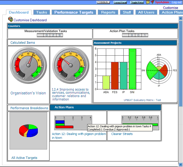
Note: The customised dashboard above shows 2 performance gauges, 2 assessment charts, one performance chart and two action plan gauges (one detailed one simple). Clicking on the graphics will drill down to the assessments, performance or action plan summary reports (this mimics the actual navigation on the dashboard although further drill down would be possible from the performance indicator and action plan summary report on a live system)
Customising the Dashboard
Users can customise the information that is displayed on the dashboard by clicking on the artists palette icon on the top left of the dashboard, this will open the customise dashboard display page. This action can be mimicked in figure 1 by clicking on the palette icon:
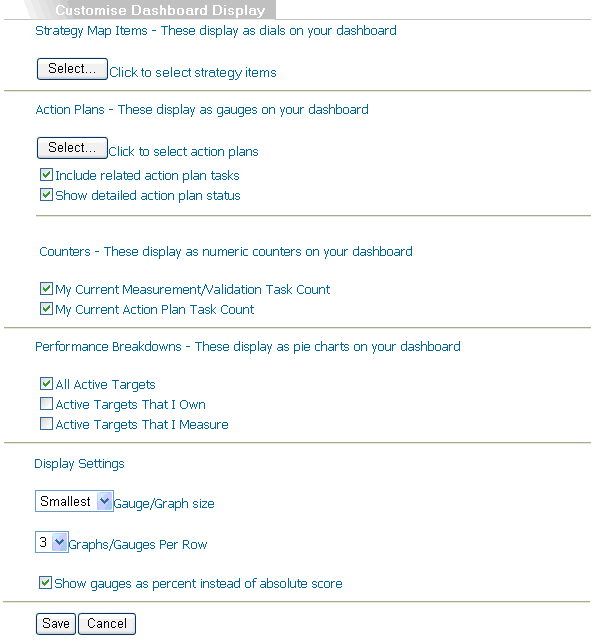
The Customise Dashboard page is split into a number of sections:
Strategy Map Items
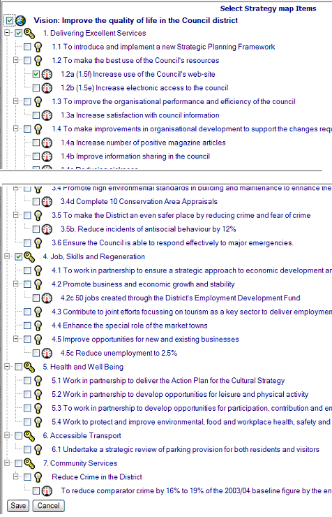
Clicking on the select button will open a new window displaying the full strategy map.
Users can select which items they would like to see displayed as gauges on the dashboard. For these changes to be reflected on the dashboard, the user must select 'Save' at the base of the item selection (figure 3) and then 'Save' again on the customise dashboard page:
Action Plans
Clicking on the Action Plans select button will open a new window displaying the full list of action plans in the system:
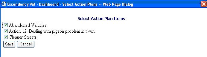
Users can select which action plans they wish to see displayed on the dashboard and will then be returned to the Customise Dashboard Page where they can make further modifications to the display before saving the settings.
The 'Include related action plan tasks' check box will additionally display the total number of tasks in all the action plans related to the plan selected.
The 'Show detailed action plan status' check box will display a separate bar for overdue, completed and approved action plan tasks. The unchecked default is one bar showing the total number of completed and approved tasks that shows red if even one task is overdue, green if at least one task is completed, and blue when all tasks are completed and approved.
In practice, most users are likely to display action plan gauges with both checkbox options checked.
Overdue tasks are red, completed are green and approved are blue. Once a completed task is approved it is removed from the green bar and added to the blue bar. A fully approved action plan, therefore, will be one blue bar extending the length of the graphic.
The action plan gauges (default and detailed), unlike the performance gauges, can be clicked on to drill down to the action plan summary report (see also Action planning help for more information).
Counters
User can select counters that show the number of measurement and validation tasks and/or the number of action plan tasks that they are responsible for by checking the relevant checkboxes shown above.
Performance Breakdowns
Users can select which, if any, of the default pie charts are displayed. All these charts will drill down to performance graphs.
Display Settings
Users are able to configure how large their graphics, how many types, and how many displayed per row .
It is also possible to select how data ranges display on gauges, the options being to show the scale as a percentage of possible achievement, or to show the actual performance score as calculated by the system (in practice most users will select the percent option). Note: It is important to realise that the performance gauge is showing performance status at time of viewing and not the percentage of a target completed. The action plan gauge does show the proportion of tasks completed and / or approved.
Note: scores attached to performance gauges are a reflection of the internal calculations performed by the system in order to assign a status to non-measurable parts of the strategy map. It does not follow that (for example) a score of 50% at the vision level implies that 50% of measurable items have been achieved but only that the organisation is at 50% of where it should be at this time.
![]()
![]()